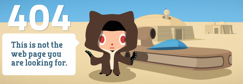
I stumbled across a great 404 page the other day over at GitHub. I’m a Star Wars fan so this really tickled me. It’s got the parallax affect too. Kinda cool.

404 pages don’t scare me anymore. I eyeballed the URL, removed an errant character and the page displayed fine. It’s not always that easy.
Friend or foe?
The GitHub 404 isn’t particularly useful, and Chris Morgan explains why in his case study. He makes a good point that really useful 404 pages are computationally expensive.
There are certain things that good 404 pages do. The page can be generic and still be helpful - this scatter/gather post covers it nicely.
Handmade 404
In my last role, our team had to create a custom 404 page and it was a really interesting exercise.
Our 404 page was not for a website but an internal site accessible only to logged-in users of our software.
We knew the page would display if:
- the user hit a bad link or typed the URL incorrectly
- the user wasn’t logged in to our software
- the URL didn’t exist because we hadn’t yet uploaded the content
- there were network problems on the server side.
Designing this 404 page required finesse and an understanding of multiple disciplines:
- technology: how the site was hosted, how it was integrated with our software and what the technical reasons were that would cause the page to display.
- ux: how users were getting to our site, how they were likely to arrive at the 404 and what information they would want to see on the page.
- tech writing: what language to use on the page to acknowledge the problem, and how to convey a clear message about the actions users could take.
- design: how to layout the page (including placement of the title, paragraph and procedure), and how to style the page to make it consistent with the rest of the site.
The content and the design of the 404 page had to cover a lot, and we wanted to keep it brief.
Rising to the challenge
We used a clear statement at the top of the page acknowledging the problem, along the lines of “We can’t display that page.”
We included a brief, 2 sentence paragraph explaining what happened, and to “try again soon” in case of network or content-loading issues.
Lastly, my colleague crafted a succinct 3 step procedure advising users to “log in to the software then try the link again”.
The page also included contact details for our Helpdesk so users could get further assistance.
The point
Tech writers rule! and if you ever get the chance to write a 404 page I encourage you to do so because they are challenging and fun.

